Gelic
Product Design + Brand Design


Gelic is an app that makes mixing paint easy. Users select their desired color and Gelic provides the information needed to recreate it and a spectrum of tints and shades.
This is a passion project I did on my own.


Brand
Gelic means to be like or similar to something. When you to take the word apart, it sounds like a combination of the words 'gel' and 'like'. The meaning reflects the goal and the sound reflects the medium. To mix a paint that is similar to a color in mind.
Logo
The logo is designed to mimic dollops of paint morphing together to create something whole. Each letter is made of thick, rounded geometric shapes. The combination of each letter results in an organic shape. The 'G' is used on its own as the app icon and in the navigation.
The logo tells a story through word and form that playfully expresses Gelic's intention.


Color
A vibrant blue/purple is the primary brand color. It resembles creativity. Historically, this color was one of the rarest and most expensive pigments to create, coming from materials like Lapis Lazuli.
#4E37E3
#130B49
#9AE4FF
#F2F2F2
#CECECE
#8A8A8A
Type
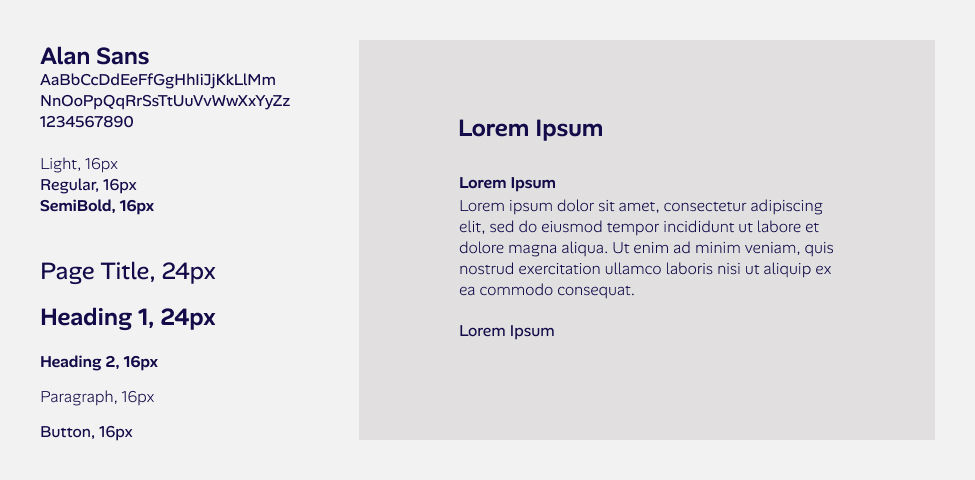
Alan Sans pairs nicely with the custom Gelic wordmark. The organic, sans serif font reads easily and has fluid characteristics. soft, rounded features give the font a friendly and welcoming feel. As a variable font, Alan Sans is extremely versatile.
Components
I created a unique set of icons to compliment the style of the Gelic logo. A tight and uniform spacing system keeps the menus and cards clean and balanced.


