
I worked as a freelance designer for Boal City throughout its foundational years. I helped to establish their identity and brand experience. I had major influence over the brewery’s interior aesthetic utilizing a topographic map of the area, an infographic of the brewing process, patterns, and murals. As well, I contributed toward the creation of store swag and event posters strengthening company culture and brand awareness.

Topographic Map
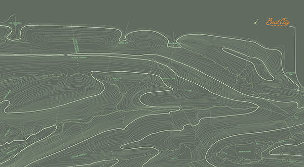
As Boal City was under construction, I worked closely with the founders to design a massive topographic map of the surrounding area to expand across an accent wall in the taproom. For context, Boal City was founded on the ideas of outdoor exploration, outdoor sports, and is located at the base of Pennsylvania’s Bear Meadows State Forest. This wall faces that forest symbolizing the entryway into exploration and a resource for understanding the area. With this map, it is clear that Boal City serves as a base camp leading into or coming back from your next outdoor excursion.
Research
In order to ensure accuracy of this topographic map, I collaborated with Columbus Chapel & Boal Mansion Museum to take out on loan a topographic map by the Pennsylvania Department of Forestry of Topographic Surveys created between 1914-1915.

Layout
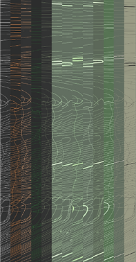
I stated be recreating the map in black and white in a vector format to get all of the essential details. From there I took measurements of the wall, it’s windows, and doors to better frame the map in the area and visualize how the finished layout will look.


Color
Next I created color variations of the map within the brewery’s pre-established brand colors matched to paint samples. I found a balance of greens that were easy to read, reflected nature, and kept the room’s atmosphere luminous and energetic.
Detail
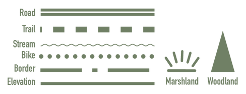
At the same time I made tweaks to line-weight, textures, symbols, fonts, sizing, and detail to refine the overall look of the map. The goal was to have plenty of detail and a consistent system without being to busy or overwhelming. The result was a system of various lines and symbols to indicate elevation, trails, roads, streams, woodland, and marshland.

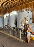
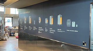
For Boal City, the quality of the beer is just as important as their love for the outdoors. Because of this, the founders wanted to highlight the brewing process and keep the brewing station transparent to the rest of the taproom. An infographic was recommended to act as an educational opportunity for patrons to read about the brewing process while onlooking.
Infographic
Research
First I spent the day with Boal City’s Brewmaster Mike Smith to get the full scale of their process, their machines, and what they use. Next, I measured the space of the wall and it’s surrounding area.


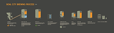
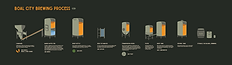


Process
I began by studying the form of the machines used throughout the brewing process, illustrating them with cross-sections to reveal the internal happenings, and labeling them. From there, I refined the illustration style landing on simple, 3-dimensional forms, making use of the brand mark as a symbol and directional throughout the viewer experience.
Orange is used throughout the infographic, as Boal City’s primary brand color, but also as an accent color to pop off the gray metal machinery and highlight the liquid-gold being produced within.
The overall brewing process is simplified and easy to digest so that any viewer can quickly take in information, even at a passing glance. For a more in-depth experience of the process, a short caption was included.

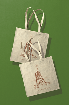
Aside from the topographic and infographic murals, I designed plenty of swag, wallpaper, systems, and posters to build on a more robust brand experience from day one.
Collateral
Merch
To build on Boal City’s values, I designed merchandise reflecting outdoor adventure and local landmarks. I followed the illustration style from the infographic and the topographic symbols I used previously to create consistency and I built on their personality.
Wallpaper
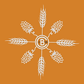
For the restrooms I collaborated with two stakeholders on separate wallpapers. The first, I took paper cutouts of wheat and hops made by a local artist and arranged them into a pattern incorporating the logo. The second utilized a sketch of a local landmark by one of the founders to create a mystical mural.


Posters
Community is a strong value for Boal City. Some of the ways they support community is through events, cubs, and local food trucks. I designed a poster to promote one of Boal City’s most popular clubs, the run club. The poster is light, friendly, and engaging to reflect its accepting characteristics and friendly tone. As well, I built a flyer template to promote Boal City’s weekly food truck and event schedule, making it easy to make quick updates and print or post to social media.